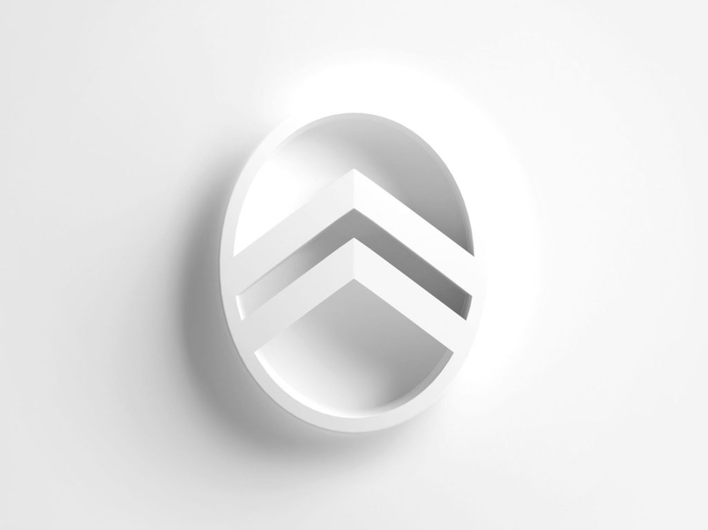
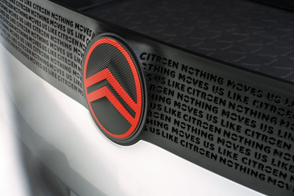
The 10th logo evolution in the 103-year history of Citroën was unveiled today. It is a design that the brand acknowledges is based on the original oval from 1919 but in a modern “further developed” form that will open a new chapter in its history. The revised logo with a vertical oval frame hosting the double chevrons (“deux chevrons” in French”) was conceived by Citroën’s own design team with assistance from the Stellantis Design Studio, a global brand design agency.
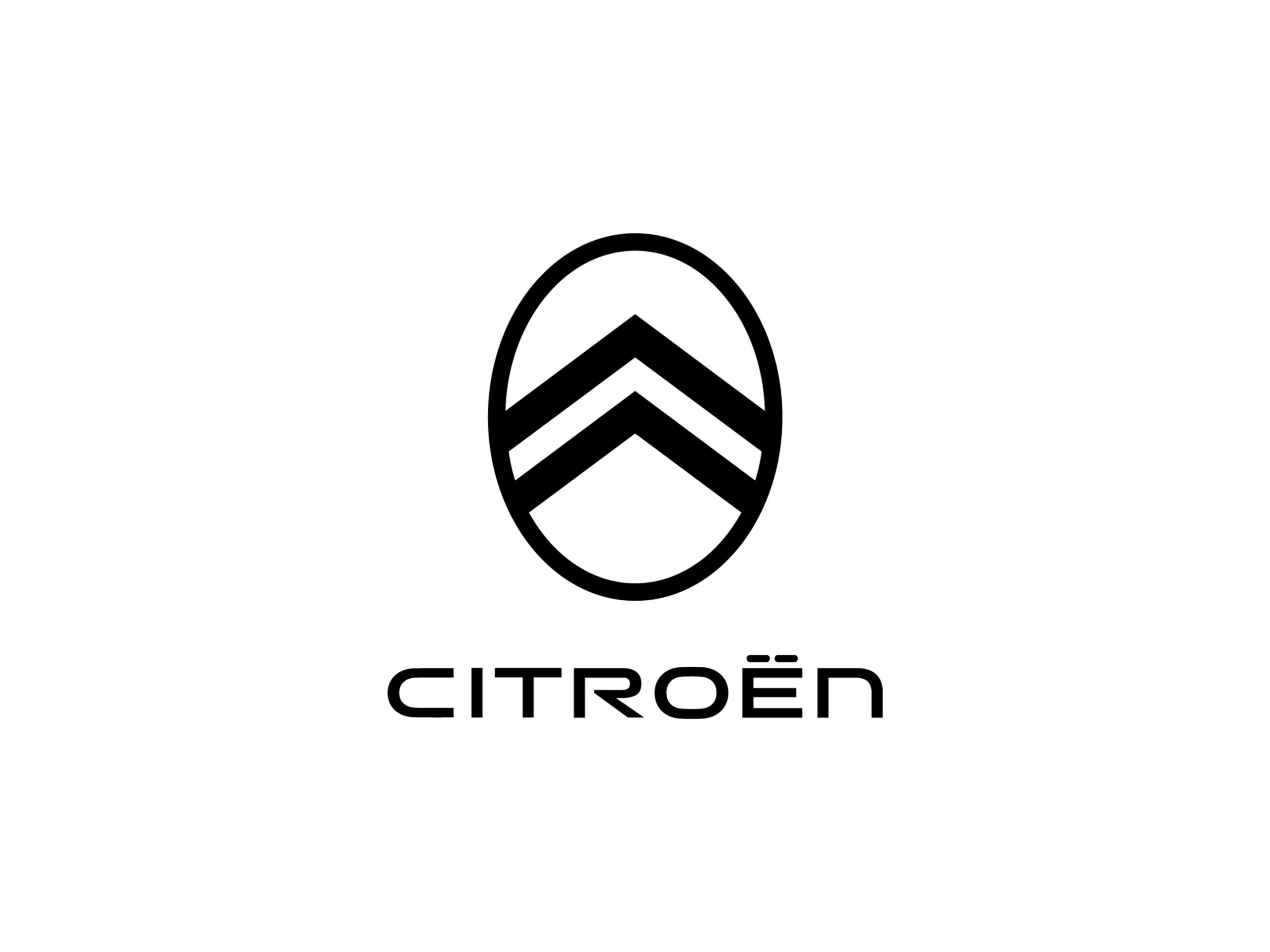

Signalling the transformation and evolution of the brand, the new logo will make its debut on a new concept car in the Citroën family at the end of September. Versions of it will then gradually appear to become an instantly recognizable signature element on all future Citroën models.
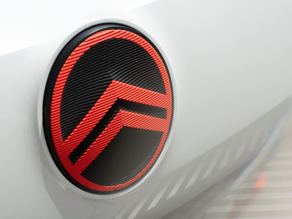
According Citroën Brand Marketing the new logo signals a new chapter in the history of Citroën Reinterpretation and will accelerate its mission of making electric mobility accessible to all with its core DNA expanded for affordability, courage and customer well-being.
The new design reinterprets the original logo, first chosen by founder André Citroën, inspired by the success of his first metalworking company, which manufactured bevel gear transmission systems. The well-known technical reference to the “double chevrons” has since been at the heart of Citroën’s identity and has always been the basis for the company’s logo.
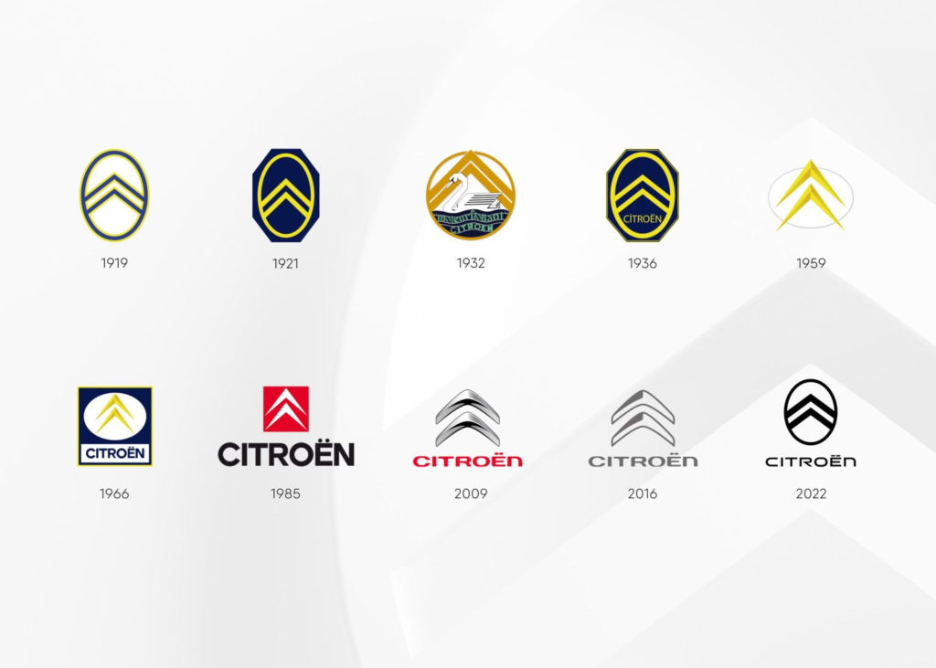
The new logo is complemented by a comprehensive brand identity program and the appearance of a new brand claim that promises “Nothing Moves Us Like Citroën”.
Vincent Cobée, CEO of Citroën, stated:

“As we begin what is likely the most exciting chapter in our illustrious 103-year history, it is time for Citroën to adopt a modern and contemporary new look. Our new identity is an elegant symbol of progress, as we move our customers physically in bold, forward-thinking vehicles that challenge traditional industry rules, and emotionally, by ensuring their entire experience - especially electrified driving - is more affordable, comfortable and enjoyable is whatever their wants and needs are. Our legacy of inspiring consumers with bold and revolutionary vehicles motivates us to take a different, more inclusive approach to mobility for future families, and we firmly believe our customers will agree that nothing moves us like a Citroën."Alexandre Revert, Global Brand Designer at Citroën, said:
“To clarify our future focus, it was logical for us to come full circle by graphically going back to André Citroën's first logo, which represented the real promise of an affordable and innovative mobility for all. The gradual transition to a more prominent and visible brand signature for our future designs is a significant if subtle evolution, where the precision of the technical, functional double angle is absorbed and contrasted by the warmth and softness of the oval that surrounds it.”A key goal was to include elements inspired by brands outside of the automotive sector to give a warmer impression of the brand that is easily recognizable in different environments. This ensures that the digital experience fully meets customers’ aesthetic expectations – including the provision of a “dark mode” option – and requirements for online sales. In addition, a new Animatic language will be developed to integrate the new brand identity across all digital touchpoints, both inside the vehicle via HMI screens and outside in the My Citroën app, to provide customers with an enriched and coherent Citroën experience.


The new logo will also go beyond the digital environment and use on and in vehicles to encompass all elements of the company’s corporate identity, from merchandising to dealership and company building signage. Efficient new signage will be lighter and more energy efficient, as well as chrome-free to increase recyclability.
The comfortable and familiar retail interior concept ‘La Maison Citroën’ is also further enhanced as it has proved popular with customers since its launch a few years ago. A fresh, simplified colour palette and new lettering, developed from Citroën’s current proprietary typefaces, complement the logo and new brand identity. While white and cool gray provide a basis for serenity and lightness, two distinctive colours are introduced as contrasts to be applied in details and specific areas.
Inspired by an important and historic colour for Citroën, used throughout the company’s history on iconic cars such as the 2CV and DS, the soothing ‘Monte Carlo Blue’ hue will return to appear in articles, merchandising and company publications. Additionally, a bright and distinctive “Infra-red” will replace the currently used red to add dynamic contrast in physical, printed and digital applications.
Laurent Barria, Head of Citroën Marketing and Communication, added:
“By going back to our roots and reinterpreting our identity in a modern way, we are sending a clear message to everyone that while we remain true to our brand DNA, things are different and fundamentally changing at Citroën. We continue to see things differently on our mission to develop bold solutions that make e-mobility more accessible. We are determined to prove to our customers and ourselves that nobody and nothing moves us like Citroën by extending the well-being we experience in the car to the entire customer journey. It requires revolutionary thinking in everything from the innovative vehicles we develop to the services we offer, and it requires us to express and stand by our unique approach. That is exactly what we promise today.”The announcement closed with this: As a bold and innovative brand, Citroën places serenity and comfort at the heart of the customer experience. Citroën offers a wide range of models − from the unique Ami to limousines and SUVs to commercial vehicles. Most models are also available with electric or plug-in hybrid drives. Citroën is represented in 101 countries worldwide with a network of 6,200 sales and service points.
In the end, we wish we could say that with the ‘what’s old becomes new again’ logo, Citroën had also announced a return to the North American market, but there was no mention of that.
