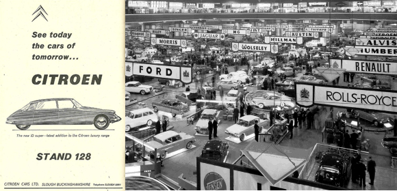
Notice anything unusual about this Citroën Ad?
by George Dyke…..
Take a look at this ad by Citroën in the UK to draw people to their stand at the 1964 Earl’s Court Motor Show in London. Does the DS look somewhat out of proportion? It is, and in many ways. Let’s compare it to a normal proportioned drawing of a DS.
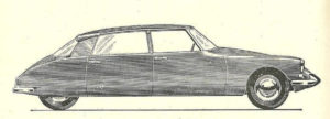 DS illustration in Earl’s Court Ad.
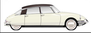 Normal proportioned DS drawing.
First thing to note is how the art department has tried to make the vehicle look sleeker by eliminating the sill section under the doors!
Second, check the wheels; – The car is in it lowest “resting” position, yet the body looks to be at normal driving height. And they haven’t stopped there…
Third, the lower body of the DS has been elongated and compressed vertically. This is evident if you overlay the normal DS over the one in the ad. Look at the distance between the front door and the front wheels. The front end of the car has been pulled forward lengthening the wheelbase and the hood while the latter got lowered giving the impression of a sleeker front end.
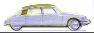 Overlay of the 2 cars with body height being the same.
With wheels pushed up, aligning the door bottoms of both cars illustrates how the headlights remain the same height but are pulled forward along with the front wheels.
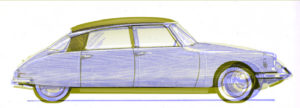 Overlay of the 2 cars with body height being the same (disregarding the height of the wheels).
Fourth, the roofline has been lowered and the rake of the windshield altered to have a greater slant. The back window remains relatively unchanged presumably because altering its angle would look too odd as line of the window has to flow into the angle of the trunk lid.
Fifth, to give the impression of it being more of a spacious limousine for rear seat passengers, the B Pillar has been moved forward and the rear door lengthened.
Most likely all of this was driven by marketing and did nothing to improve the elegance and timeless styling that Flaminio Bertoni designed. If anything, it looks too vertically squished. However it was done for a purpose and one has to wonder how many more DS were sold into the English market as a result of such manipulation?
