By Geoff Fitzgibbon….
You might recall George Dyke’s excellent rant in the March Citroënvie Monthly Update about stupid car designs. George’s experience struck a chord with me. I also have some pet peeves about current auto design and auto ergonomics, which I would like to share.
But first, here is George’s original article in case you missed it first time around:
I so appreciate classic Citroën engineering and design, especially in light of what the auto manufacturers are pushing on us today. Case in point: I was in a new Genesis GV60 the other day that is the epitome of dumb design for the sake of bling. There is a gear selection knob on a center console that you rotate for Reverse, Neutral and Drive. The Park function is a push button on the top of the knob, and if you depress that it rolls like a pool table ball to reveal a crystal like dome with embedded diamond etching that gives a glowing orb effect.
No kidding — here’s a video of it operating: https://www.youtube.com/watch?v=XGn8mrxGt-0.
Lord knows what you do if it breaks and what it costs to repair?The display screen (that takes up over half the dashboard) is controlled by another knob in front of the gear selector on the console with a plethora of sub-menus you must navigate through to display much of what you need to adjust things while driving!
I may be getting old and cranky, but I’d rather be hands-on behind the wheel of a CX or any classic Citroën, than an e-fangled Genesis whizmobile.
George is so right: auto design and auto ergonomics seem to have taken a strange turn lately.
Most of us grew up seeing manufacturers, especially Citroën, SAAB and VW, design their cars with the car’s function and the needs of the driver first; the form of the automobile then followed on.
But manufacturers today seem to reverse the process, starting with ideas that often seem – to me – not to have had too much commonsense evaluation or much consideration given to how drivers will use them.
I am not a complete Luddite, BTW: I do admire all the wonderful things engineers provide us to improve our driving and ownership experience – like direct fuel injection, ABS, electronic stability programs, adjustable dampers, rear-view cameras and so on; but I have no time for engineering that seems frequently to be solely for its own sake.
Here is my very personal list of Things That Should Never Have Been:
- The prize for Cost Saving sold as Innovation:
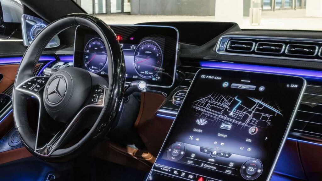
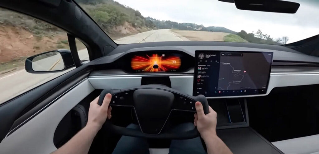
- Several worthy contenders here but touchscreens and mouse-type controls win this one hands-down. Anything that requires the driver to take their eyes off the road should never have made it to market – let alone be advertised and (sadly) embraced as an advancement.
- For example, the 2025 BMW X2 uses just 2 buttons, one for the rear defroster and another for the front; everything else is found by a menu. It also uses a rocker switch to select the transmission.
- And a recent road test of the latest Mazda MX-5 found using its infotainment commander, “cumbersome and borderline dangerous while driving”.
- What was ever wrong with using a discrete switch for a function?
- Award for Zero Marginal Benefit, positioned as New and Amazing:
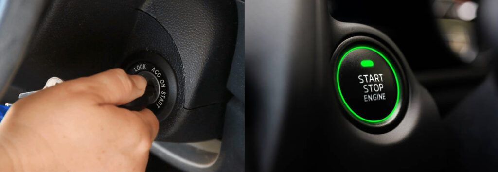
- My first 2 cars (both 1950s models) used an ignition key switch and a push-button start button, both dash-mounted. Every car I have driven since then has used a key that went into a combined ignition/start/steering lock on the column. Simple, ultimately reliable and logical: turn the key and the car starts.
- But someone decided recently it was time to go back to the 1950s. Modern cars now require the driver to place a key fob in the car and press a large button labelled START.
- For saving us from having to twist a key in a steering lock, we thank you.
- What a pity that the same technology which enables the key fob and the car to converse together in this manner has also enabled the largest increase in new car theft ever.
- The Runner-up for the Let’s Piss Off the Driver Daily nomination:
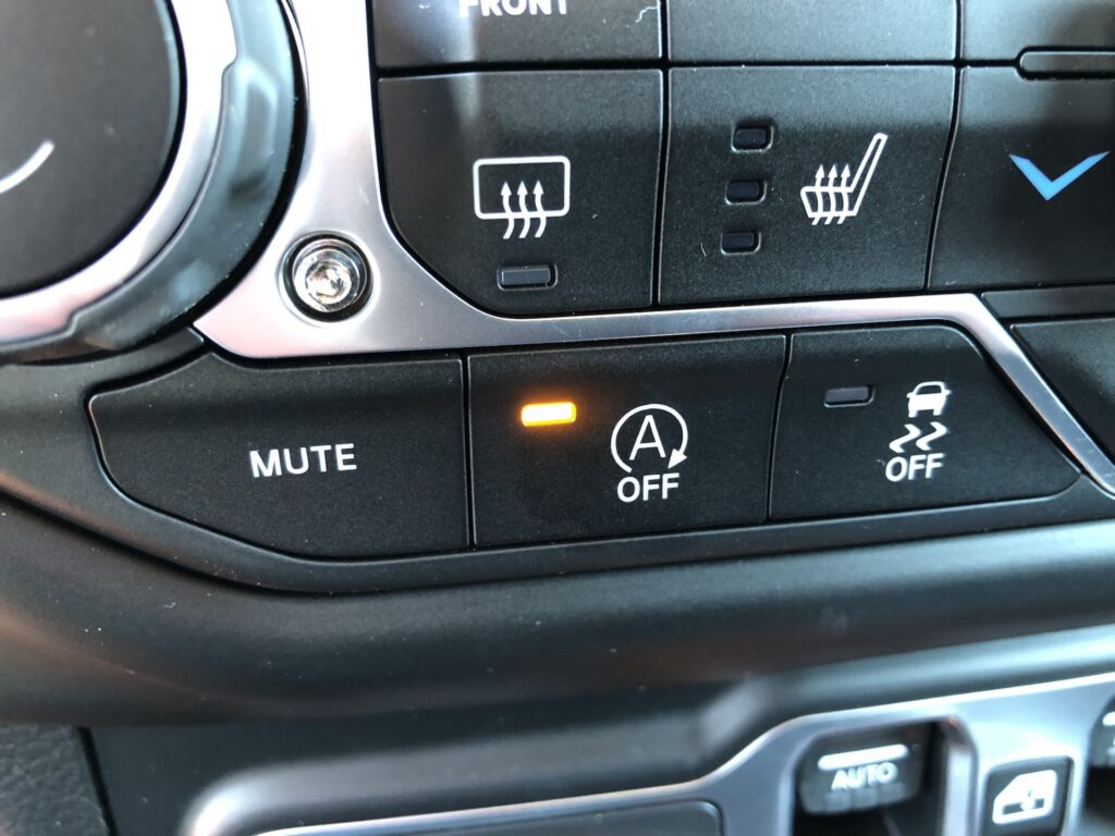
- Along with the START button invention above, we have its cousin, the Stop/Start function.
- This automatically stops the engine a few seconds after the car stops if the driver’s foot is on the brake. It starts up the engine again when the braking pedal is released. All this to decrease fuel consumption in the quest for saving gasoline costs and helping emissions.
- It sounds OK until we learn “the rest of the story:” the stop/start function requires the installation of a much heavier-duty starter motor and an Activated Glass Mat (AGM) battery.
- Replacing these two more sophisticated parts in an average vehicle in Canada costs $925 more than a traditional starter motor and lead-acid accumulator battery costs in the previous generation of the same model – according to my local mechanic.
- This is being done to save all those miniscule amounts of gas that otherwise would be used while the car is stopped in traffic or at a light. And the modern car almost cleans the air while it is running. This is greenwashing at its very best.
- Everyone I know who has a car with this feature either has it disabled permanently at the dealer – if that is possible – or they use the function’s temporary OFF switch that is buried somewhere on the dash whenever they get in the car, to disable the function for each journey.
- Let’s start a petition to send all recent auto design grads back to Art College.
- OK, I admit I am biased here: I own a Citroën BX which has superb visibility from its large windows and an angled hood design, for pedestrian safety and for my driving convenience. Such passive safety considerations should be at least as important as active safety systems, but the focus today has switched to electronic nannies instead at the expense of good design, IMO.
- Is it a good thing that modern cars have less and less visibility? My Ford Fiesta is typical of the trend: my petite wife tells me she feels like a little kid peering out of the small front side window, and the view from the rear side window is even worse.
- But at least my Fiesta’s hood is sloped. I know this was intended for good aerodynamics, but a pedestrian might also stand a chance if we meet each other abruptly. The same poor walker would be just a sad statistic if he or she hit the front of any of the latest pickup trucks or most of the large and popular SUVs, and many of today’s other vehicle types.
- Aggression in frontal auto design seems to be the watch word today, along with body panel fold lines and creases that suggest a sword fight happened along the way; way too martial and threatening for my tastes.
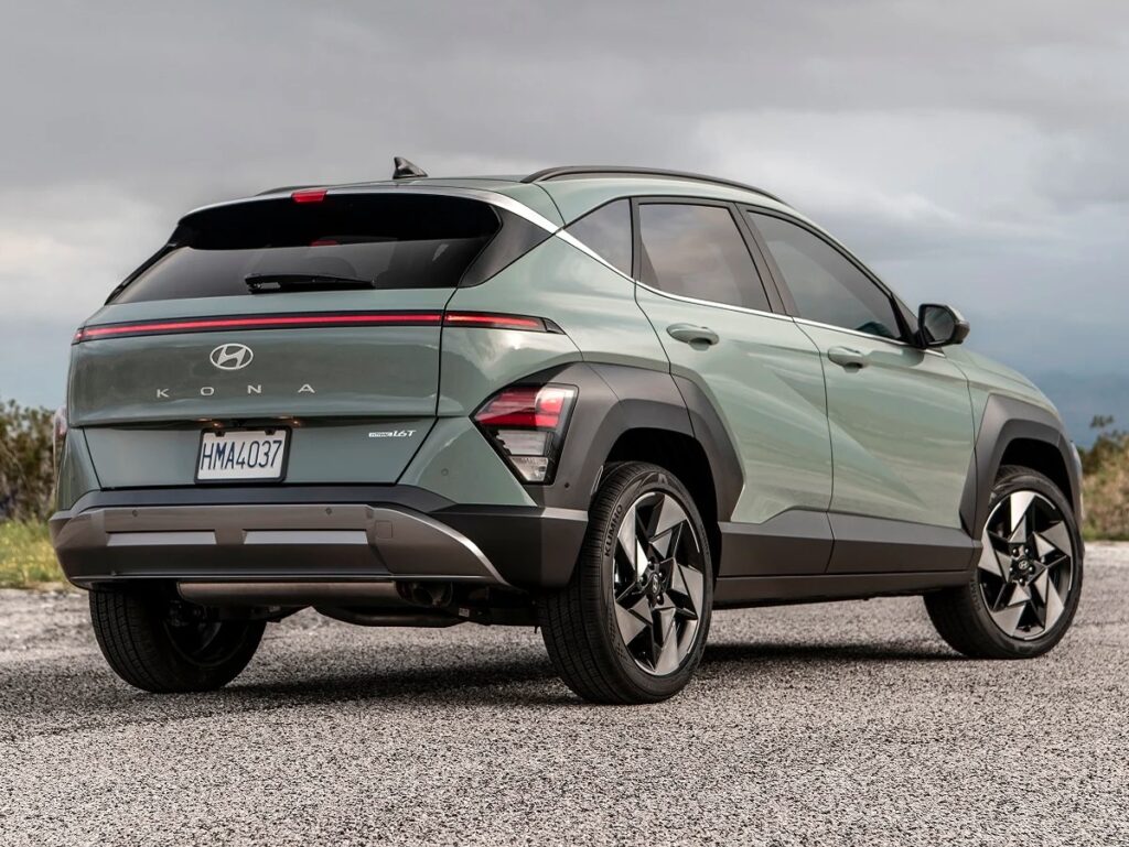
- And what ever happened to rear turn signals positioned where we could actually see them? If the DS had the most visible and elegant turn signals integrated into that lovely trim line along the car’s roof line, then the latest Hyundia and KIA models must have the worst.
- Their latest models incorporate stealth-like turn signals, positioned so low down they are almost invisible in stop-and-go traffic, especially if they have picked up dirt deposited there by the vehicles’ hatchback-like styling.
- Some modern cars even place the rear turn signals in the bumper, where they are just asking to be damaged when the driver behind is in a hurry. The Koreans are not alone: even GM has embraced this retrograde design trend. Let’s bring back turn signals other drivers can actually see.
- Let me end with a request. Can designers kindly get back to producing graceful, flowing and even beautiful car designs – of which Citroën designers were often the masters? Let’s bring back eye-pleasing design; and let’s also have some brighter colors with even a little joy and fun in them; isn’t life too short for drab?
- Zero to 60 in under 6 seconds!
- Have you noticed how all of the recent, remarkable increases in ICE design and their resulting efficiency gains are being used not to make vehicles lighter and use less fuel but in competitive fights for the most horsepower and the fastest acceleration? And this is happening as roads become more congested and fuel costs continue to rise.
- For example, a 2001 model-year Porsche 911 coupé with Tiptronic transmission could hit 0-63 mph in 6.0 seconds. Not too shabby, but then it is a Porsche. However, even a 2024 Ram 1500 “Tradesman” (the most basic RAM pickup truck) can do it in 6.4 seconds. Take that, Stuttgart!
- A recent article in Car and Driver justified the rising horsepower numbers by claiming that safely merging from a ramp onto a freeway requires such acceleration. Absolute heifer dust: the minimum ramp length mandated for all US Federal freeways would allow my 1990 BX 1.6 to hit 80 MPH before I had to merge; even a Chevrolet Spark can merge safely. This is just silly, and possibly dangerous: how many folks do you know (besides you, of course) who can properly handle a vehicle that produces 350 bhp, even with all the safety-nanny features we have now? Plenty of used cars can better that, such as fairly mundane 2014 model-year cars like the Chrysler 300C, Genesis Coupé and Cadillac CTS.
- Wouldn’t we all be better off making cars that tame it down a bit and give us great gas mileage as well? That must be better than using foodstuffs to make ethanol and mandating its use in our cars, so that we can decrease the use of oil.
- Cars would still be a blast if they “only” hit 0-60 MPH in 7.5 seconds instead of 5.5 secs – and they would give us far better MPG while doing it. Just a thought.
- An electric parking brake – really?
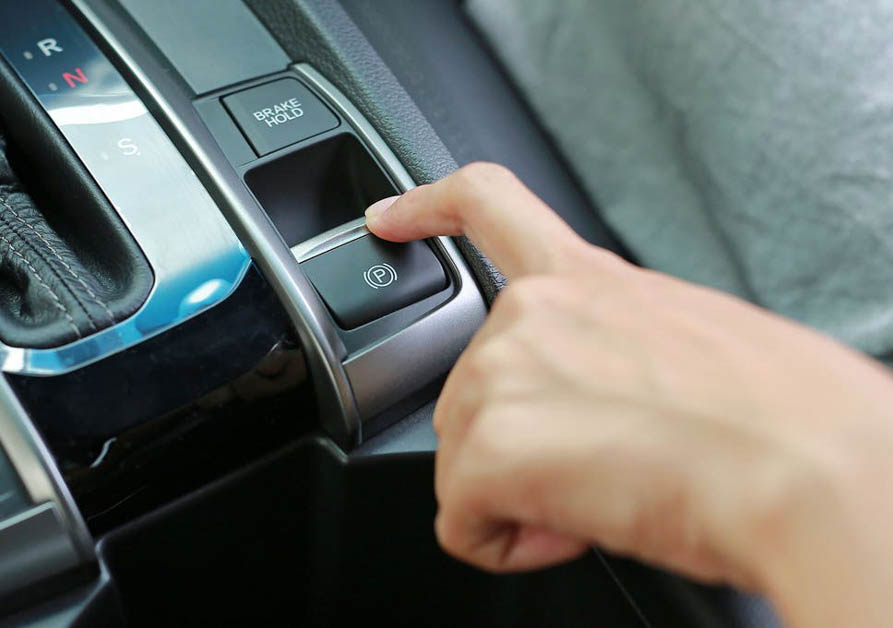
- I did not believe we had such things until I drove a car with this feature. It is basically exactly the same as it ever was (except on most Citroëns), a cable running across the two rear brake discs or hubs, but its activation is via an electric solenoid instead of via a hand-lever lever, ratchet and cable.
I am beginning to believe predictions that humans will eventually have very few muscles except enormously strong thumbs.
Such complexity comes always with shorter life and less reliability than the “old” version, but at least it provides more room for even larger touchscreens 😊.
Keep on driving: it’s still fun, and it will frustrate the politicians and their central planners.
